Towards my project for D&AD – Make Your Mark, I wanted
to advertise myself as designer as author and represent my qualities with what
would make me different and stand out. In order to find the kind of designer I
am, with what I enjoy most I noted down three possible concepts.
One: Origami/paper engineering
I have not had much of an opportunity to explore his as of yet, although this is something I would definitely like to experiment further with. After creating a pop-up book in my first year of university, I found it frustrating and a big challenge, the end result although was satisfying.
Two: Illustration
After studying only Art in school and Art & Design as a major through college, I do also enjoy illustrating. (mainly watercolour painting)
Three: Experimenting with Typography
I hated experimenting with Typography during my first year of university, there was never a meaning for it, and it all just seemed to be done for a bit of fun. Yet through my second year, as part of one of my major projects I worked with water typography; although this was only a small proportion of the work) I remember really enjoying it and the final outcome of this was quite effective.
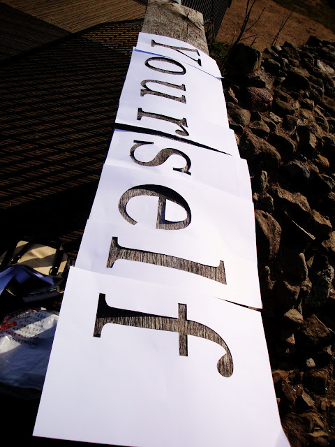
Below is some of my typography in the environment
experimentation work. (Each word represents a word of the quote ‘Be yourself,
everyone else is taken’ You may notice some mistakes ‘eLSe’ and the leading
between ‘B e’ Which is why I decided to
reproduce these. I think the water typography for ‘Yourself’ is much more effective
than ‘B e’ I think choosing a serif
typeface for my second attempt was a better option, and a lot of this may be
because of the length of the word, which gives it much more impact.
I will later post my final project submitted for D&AD. They were experiencing some technical issues yesterday, although I did manage to finally submit my project this morning, they have now extended the deadline until Monday 12pm.
I will later post my final project submitted for D&AD. They were experiencing some technical issues yesterday, although I did manage to finally submit my project this morning, they have now extended the deadline until Monday 12pm.


